Thursday 28 October 2010

More coloursss

Lots of pictures and no time to describe them..

A couple more testers and swatches and a quick photoshop mockup of an experiment I want to try tomorrow...

A experiment looking at grains of wood and trying to get them to point towards the Kusnthaus


Another experiment focusing on wood grain. This time looking at layering wood to represent floors of buildings.

Picture looking at the main colours of the model. Tempted to use the varnished roof finish instead of the bright red one. Will do some more swatches tomorrow.


Finally a PS mock-up of the base board on a natural finish base board. The idea is to have the Crab studio shape I created act as a boundary between the old, natural coloured model and the newer, colourful, Crab studio area around the Kunsthaus. This is interesting and I am going to make a physical sketch model of this idea tomorrow.

Tuesday 26 October 2010

Coloursss

Swatches and swatches and more swatches...

Here is a pic of a few:


Bold and bright is the way forward. Anything white or neutral just doesn't really seem to fit in with the style of Crab Studio. Will be interesting to see whether or not the Kunsthaus Graz still 'pops' out of the contextual buildings though.

I like the finish on the wooden blocks and will develop this further. The wood veneer on the right has been coated with a mahogony varnish near the top and painted a light yellow further down. I don't think the varnish is an option as it keeps coming out to dark.

Now shield your eyes...


As you can see I am no Photoshop connoisseur and this was just a bit of fun to see how the colours worked with each other. Very bright! More samples tomorrow on different surfaces and experiments to see what works with what.

Monday 25 October 2010

Funky Base

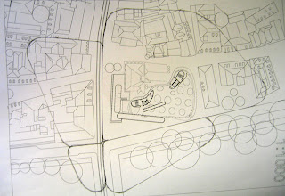
Today was spent developing more base shape ideas. I have been printing out 1:1000 scale plans and drawing on them until I find something that looks promising. Building on from where I left off last week, I have scrapped the idea of having separate sections and gone back to basics.


I liked the shape of the 4-section base idea but didn't really think it worked so I tweaked some of the corners and edges and a couple of iterations later ended up with this dynamic (and rather Crab studio) shape.


Trees around the buildings are represented by the holes in the base board. There will be others (especially on the river bank) but I liked this idea as it ties in with the Crab studio tables.


The large block building on the left of the image will be cut back a little more as it hangs too far over the edge.


I like this shape base board and I think I might hold on to it for now while I start looking at other areas of the build. I think it ties in nicely with the past works of Crab studios and certainly looks different but is not just an arbitrary shape as the edges all follow and run with certain features of the area plan i.e. the bank of the Mur, the tram line and the edges of buildings.


Next...


This is just a very quick experiment into weathering colours on wood. I first sprayed the pieces and then sand blasted them once dry. Needless to say it failed as the colour was stripped instantly and I didn't get a chance to recoat them. I also want to look at different varnishes to see if I can get a nice red colour for the roofs of the contextual buildings.

Thursday 21 October 2010

Battling the base

I spent today experimenting with base shapes after looking at some of Crab studios other work (especially their tables) and these are a few rough versions of what I came up with.

The first base was arbitrarily sketched down and then cut out just to see what a non-regular shaped base would look like..


 I quite like the idea of having buildings over hanging slightly but this is to much. Also, in certain areas the curves of the base are lost beneath the contextual buildings making it pointless to have curves in the first place.


Having learnt from the first, the second base came out slightly better. Looking at Crab Studios pictures of library tables, you can see that they are designed to fit together to enable people to form their own working areas and I liked this idea.


 I tried splitting the plan up into sections by following roads or pathways  and came up with this first version.


It's a bit funkier but still needs lots more developing. I am going to spend a bit longer rearranging the sections and tinkering until hopefully something springs up.

 I think the base shape could be more detailed and intricate then I am currently seeing and I'd like to play about a bit with the topography and the colour as there's something quite sterile about a white baseboard!

Tuesday 19 October 2010

Sketch model

After 2 days spent adjusting plans, cutting out little bits of MDF and chemi-wood and playing about with plasticine I am left with a rough looking sketch model of the area in 1:1000 scale.


Some of the many


Overview

Detail
 The sketch model has helped me to start working out the rough elevations for all the surrounding buildings and also how large the Kunsthaus Graz will look when in amongst its surroundings. What immediately impressed me was the striking contrast between the form of the new building in amongst its older neighbours and how this is communicated in the sketch model. I also like the contrast between the colours and materials and this is a theme I think I will explore further with more samples and experiments (established, more traditional materials vs. cutting edge, twenty-first-century materials)

I think I will also experiment with the base a bit further after consulting the client as a rectangular base does not seem to fit-in with the subject building. The final scale for the model at the moment sits at 1:500.

Thursday 14 October 2010

Plans cont.

Finished roughing out the site plan from bing maps. They're far from perfect but are accurate enough for low detail contextual buildings. Tomorrow will be spent making quick sketch models to experiment with different forms and layouts.
Basic area plan

This map will be cropped soon in order to find a correct size of the finished model. The size will be ascertained through experimentation with sketch models...

Tuesday 12 October 2010

Intro and plans

Hello and welcome to my online blog!

The purpose of this diary is to document the design and building processes of my current project at the Arts University College at Bournemouth.

The unit is based around an external brief which a client from outside the course must submit. I have been asked by CRAB studios to build a scale architectural model of the Kunsthaus Graz, which is in the Austrian city of Graz. It is a very modern building which serves as a space to exhibit art. It was designed by Peter Cook (of Archigram fame) and Colin Founier and features many interesting features, most notably the 'biomorphic' structure and the BIX facade which allows images, animations and films to be displayed.


Now, the build.

I have been given a few architectural plans but most of these are very old and not purticularly accurate. Because of this, I have spent the last couple of days tracing these plans into Rhinoceros (a CAD program) to try and get them to a consistent quality.


From left: Original plan, ground floor plan and plan of the roof.

Another problem is the lack of an area plan. This is vitally important as I would like to include a large amount of 'contextual' buildings (the surrounding, old fashioned buildings) in my model. Plans and elevations of these buildings will prove very handy in the future so I have made a start producing my own by tracing maps of the area using google maps and bing maps.

Half traced bing map picture
Accuracy is not of paramount concern in this project as the client wants the 'form' and the context of the building captured, as opposed to 100% perfect sized window frames and lamp posts.

Once the area plan is traced out and adjusted, I will scale it to 1:400 and print out the plans onto paper/card. Then the real modelling can begin!